A recent visit to the Providence Art Association and Museum (PAAM) offered the opportunity to see the multiple shows they currently have on display.
The space at PAAM is beautiful, with creamy white walls and dark hardwood floors. This may be a relatively traditional museum and gallery layout, but the natural light flooding in from the large windows at the front add a dimension that can be missing from larger museums.

During this summer visit, the following three shows were on view:
- Selections from the Pat and Nanno de Groot Collection (through September 8, 2019),
- Circa 1945: Abstract Art in the Renee & Chaim Gross Foundation Collection (through September 15, 2019) and
- Stephen Pace in Provincetown (through September 1, 2019).
In all three exhibitions the vibrancy of the works and the diversity of their textures created a narrative arc from one show to the next.
SELECTIONS FROM THE PAT AND NANNO DE GROOT COLLECTION

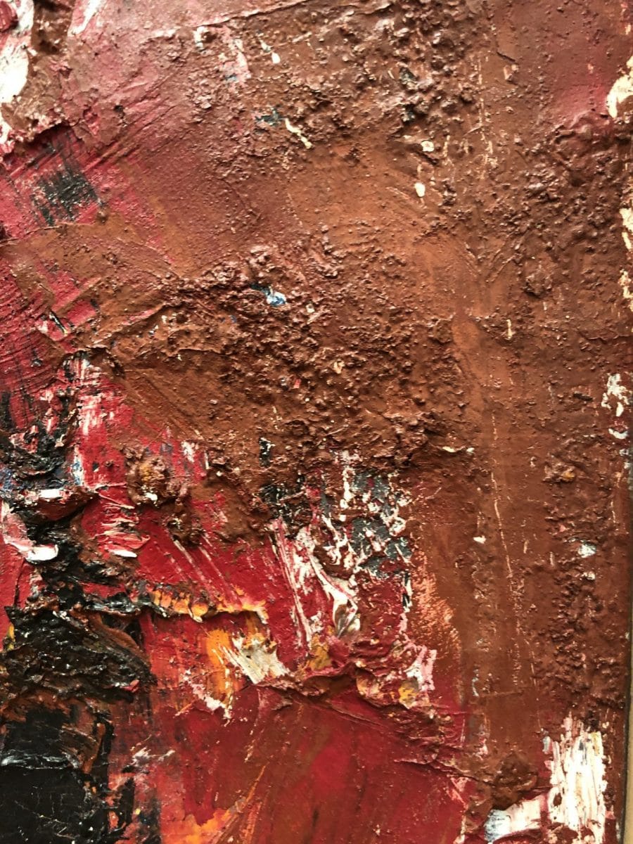
Starting with the Selections from the Pat and Nanno de Groot Collection (through September 8, 2019) impasto was used to suggest movement and texture in the natural world.
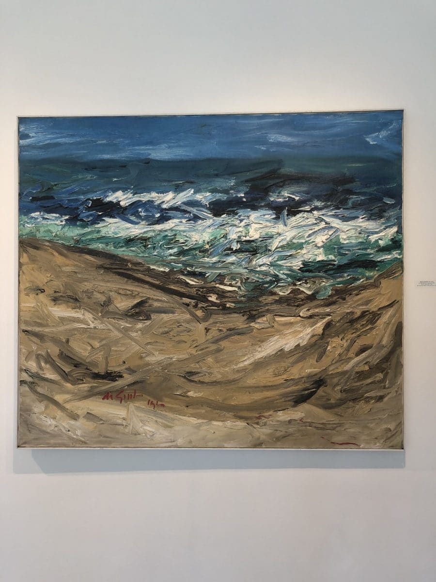
Untitled (abstract seascape), 1960
Oil on canvas, 52 x 60
Untitled (abstract seascape) uses the texture of the paint to give the sense of the ocean's changeable nature. In some places, it seemed as though the artist squeezed the paint directly out of the tube and onto the canvas, as it retains its round shape even now.

Untitled (abstract seascape)
Bright colors mix together with white, creating a foaming wave, crashing between two sandy shores. The impasto is used judiciously in the ocean - not everywhere - to draw the viewer's eye to the center of the piece. One's line of sigh roves with the churning water, following de Groot’s confident brush marks.

Other pieces of de Groot's follow a similar theme, creating atmospheres based on the texture of the paint: grass seems to wave in the wind and trees stand tall and frozen in a winter landscape.
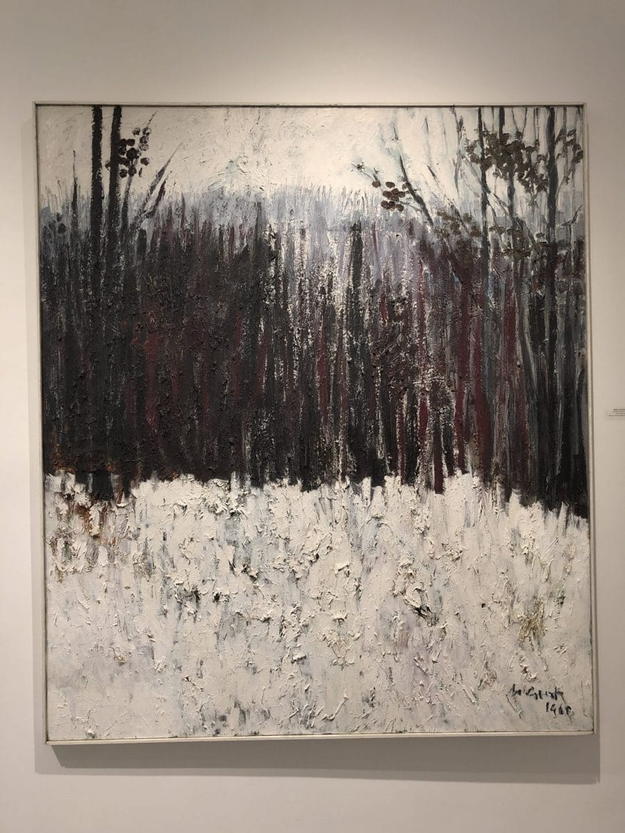
untitled (abstract forest) 1960
Oil on canvas, 60 x 52
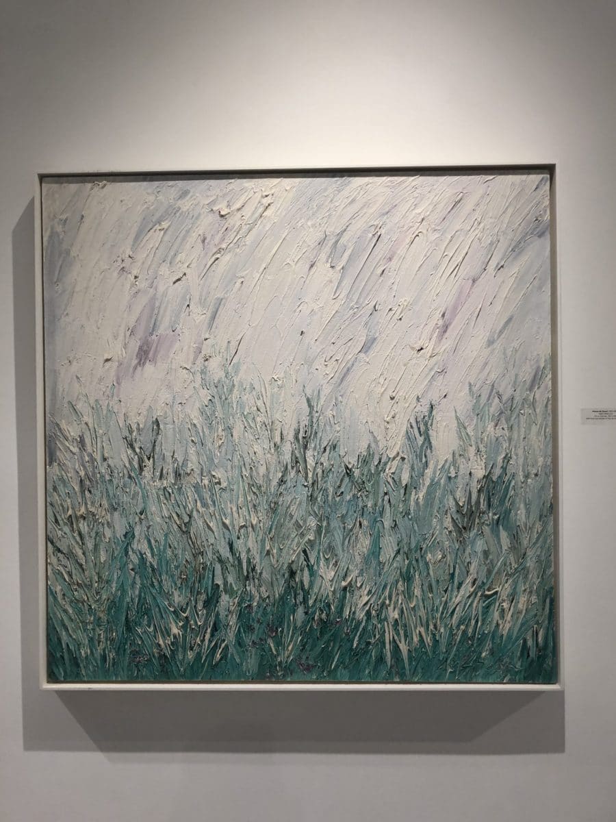
Light Field, n.d.
Oil on canvas, 40" x 40"

Up close, the paint virtually drips off of the canvas in Light Field. It clings tenuously in place and gives a delicate sense of balance and flow to the field of grass.
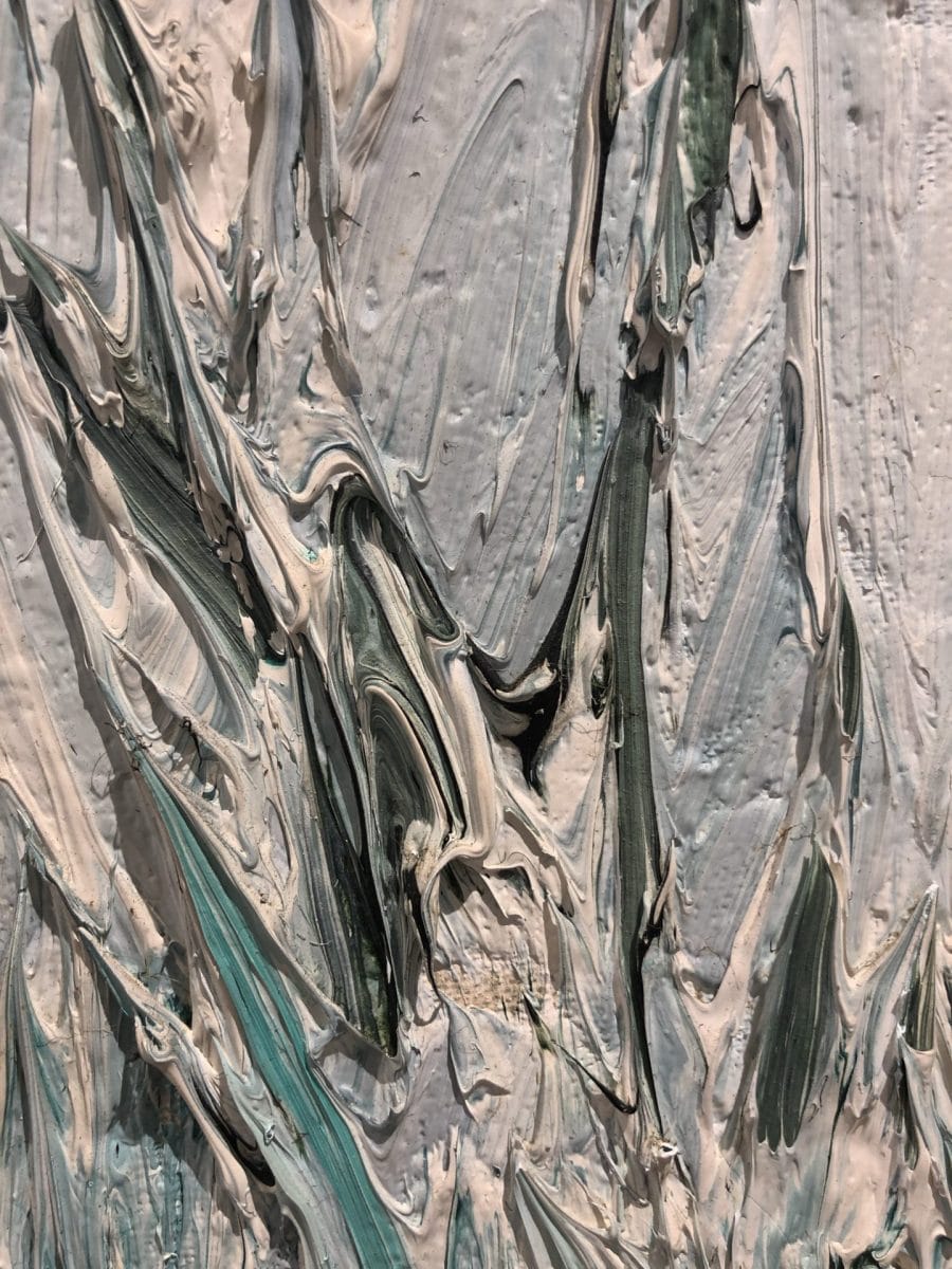
The rich greens give way slowly to lighter hues and then a white sky, in a piece that similar to Untitled (abstract seascape) seems to straddle the line between abstract and representational work. However the textured sky loses depth due to an over-application of the paint, which doesn't allow the textured grass to truly stand out as it could otherwise.
CIRCA 1945: ABSTRACT ART IN THE RENEE & CHAIM GROSS FOUNDATION COLLECTION
If we take the concept of "texture" and apply it three-dimensionally, the works in the Renee & Chaim Gross Collection are lovely to behold.
The curves of the dark woods and bronzes seem to call to be caressed by a lingering fingertip or smoothed by an entire palm.
Seated Figure
Alexander Archpenko's Seated Figure takes an abstract approach to the human form. The curves draw closer together and further apart in the negative space, creating the illusion of a person, whereas fascinatingly, the outside shape does not follow the same lines.
This dissonance leads the eye (and the mind) to linger over this relatively diminutive sculpture, attempting to fully comprehend its contours and their significance. The shadows cast upon the wall are a tantalizing counterpoint to the piece as well.

Seated Figure, 1947
Bronze, 24.5" x 9" x 6"
Completely smooth, the dark brown patina of the figure is exceptionally rich. It deserves to be admired as well, in addition to Archipenko's beautiful use of space and form.
The Lindbergh Family and The Hauptmann Trial

The Lindbergh Family and
Hauptmann Trial, 1932–34
Golden streak ipilwood,
64" x 6.75" x 5.625" each
It seems a bit incongruous to imagine that these two sculptures are actually meant to represent a tragic crime and the judicial machinations borne of it.
Yet, given the pervasive nature of the media coverage at the time, it's no surprise that such a moment in American pop culture would find its way into artists' work.
Nonetheless, the sculptural abstraction does present challenges for the average viewer attempting to to parse out meaning and/or a narrative arc in these vertical pieces. The mere fact that Chaim Gross elected to create two parallel vertical narratives is exceptional. Why on earth would someone equate one of these stories with the other? Yes, they are linked, but certainly not equal. Yet, the texture of the pieces, the rough and the smooth parts of the two sculptures are some areas where one can derive meaning. One can imagine the smooth rounded forms being those of either peace or fretful waiting whereas those of rough texture or significant angles representing dramatic developments.
An interesting question would be to take other pivotal moments in 20th century American history and give them the same totemic narrative. How would other "Trial[s] of the Century" appear?
The third show visited in the triad currently on view at PAAM is Stephen Pace in Provincetown. Pace's works (on view through September 1) can also be enjoyed through the lens of texture and its use in his work. Pace's use of texture, one can argue, also helps to create meaning, movement and drama in his paintings.

Oil on canvas, 102 x 84
Pace's technique varies from thickly applying oils to the point that they appear almost caked on to the canvas to lightly brushing pigments onto raw canvases. Both techniques contribute to the meaning and understanding of his oeuvre.
Pace's abstract works are richly hued, featuring many diverse colors and pigments. The paint is applied to the canvas using a diversity of materials including brushes and palette knives.

Layering gives the abstract pieces even more depth and visual interest.

On the other hand, Pace's figurative work tends to be flat and lacking in texture. Perhaps he considered that the "real world" was so overwhelmed with texture and nuance already, that his job was to capture only its purest essence on canvas.
Oil on Canvas, 42 x 60
The figurative pieces from the end of the 20th century sit in stark comparison to the abstract which evoke significant amounts of layering and nuance.
The painting is made up of approximately four colors. Brush strokes feel hurried rather than masterful, and texture is an afterthought rather than purposeful.
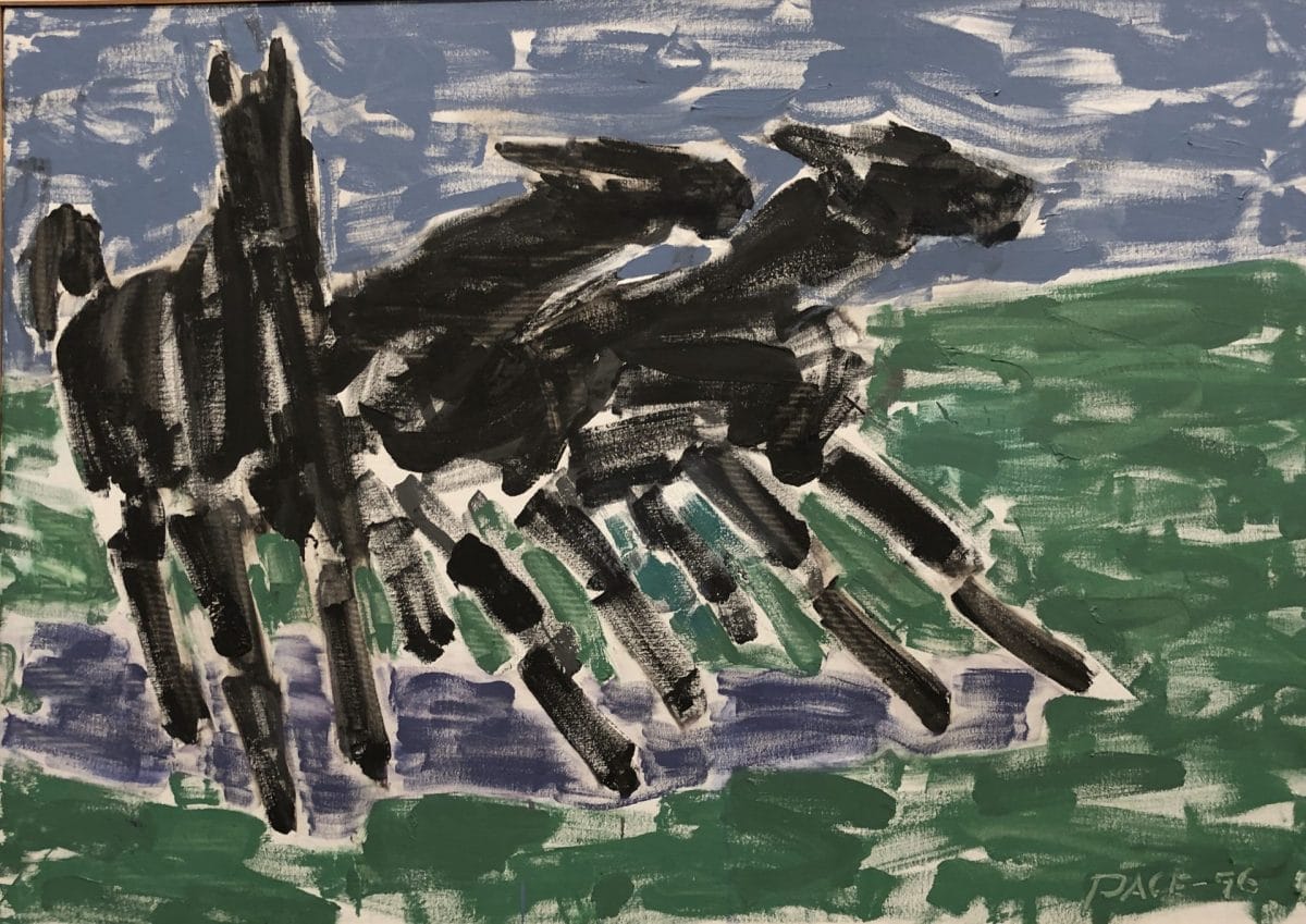
His images of horses and nudes are mostly gestural sketches that quickly capture movement through only very few brush strokes. Interestingly, these are his more recent works - from the 1990s, whereas the abstract pieces date from the 1960s.
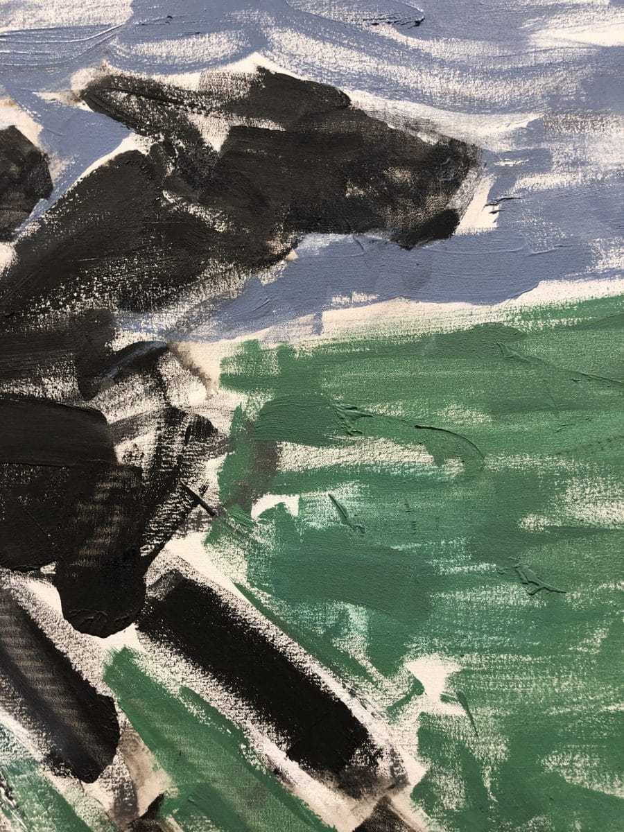
While there is clear talent in the gestural brushwork of the pieces, the figurative paintings as a whole seem dry and brittle. The work appears rushed with the canvas showing through. Like a stale cracker, it looks fine on the outside yet crumbles unappetizingly upon closer examination.

One may argue that the technique of these quick "sketches" is suited to the movement of the horses. Yet, this same technique is applied to Five Bathers No. 2 below, which gives the work a rather disjointed and frenetic pace, rather than the languid feel one would usually associate with bathing.

Oil on Canvas, 60 x 84
"Perhaps these women are painted bathing in a rushed way, in cold water as they prepare for a busy day!" you might say defending Pace's more recent work... And indeed, perhaps that is the case. And yet, one would still argue that the effort put into these pieces cannot possibly parallel the abstract pieces of his younger years.

Undoubtedly, there is value in all Pace's work. And there is particular value in seeing all these pieces together in conjunction with one another. Yet it is hard not to compare one series with another when given such a propitious opportunity.
Having looked at Pace's latest figurative works, let's now enjoy the multi-faceted textural richness of Pace's abstract pieces.
Pace's Abstract Works

untitled (58-13), 1958
Oil on canvas, 90 x 118
Using a 6 foot tall human for scale, one really gets a sense of the size of Pace's work. The gestures, and color blocks used in these pieces creates structure where the eye craves order.
From within this framework, the detailing of each individual area and the application of the paint give his work life.

One can trace the movement of the palette knife (or brush) across the canvas, watching where it has covered - or left bare - the work underneath.

Pace builds up layers of paint, and it mixes wet on the canvas, adding drama and color dynamics that play in a similar way to de Groot's work.
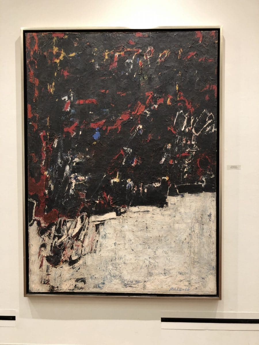
Many of Pace's paintings have textures and details that are just too gorgeous to miss, but often require close examination to truly enjoy.
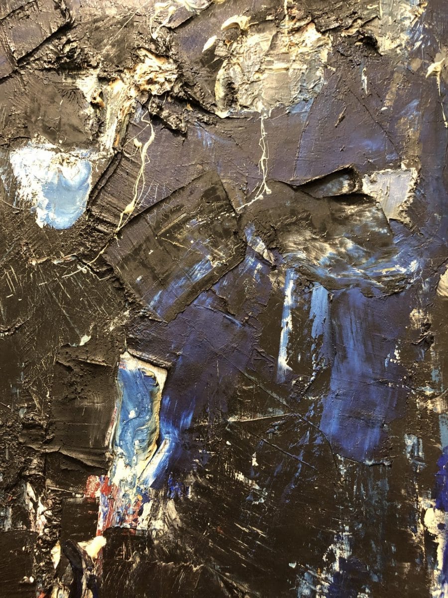
In could be easy to walk by a piece that seems to be mostly "black and white" from afar...
Oil on canvas, 74 x 54
Yet, taking a closer look, one is amazed by the application of the black and white paint over rich reds and blues. The use of (one may guess) a palette knife gives smooth areas and hard ridges, contributing to the dramatic feel of the black overlay.

In the next two images white and yellow paint splash or drip off as paint is applied, demonstrating how gravity and momentum play a role in artwork, and particularly in painting. The speed at which Pace moved his brush must likely was part of his mark-making style.
One can sense the frenetic energy behind the fast-paced upward movements.

Below one can see where Pace pulled the paintbrush directly up from the canvas in the white paint creating a rippled technique similar to what one sees on cake icing. It's a unique brushwork movement and noteworthy as one can imagine the exact motion required to make such a mark.

A final piece of Pace's is featured, again, just for the sheer enjoyment of his use of texture.
Untitled (55-31) combines aspects of many of the abstract works above (the bright colors, the black overlay, the hastily applied slabs of paint) and brings them together in what I would consider the most visually arresting piece in his exhibition.
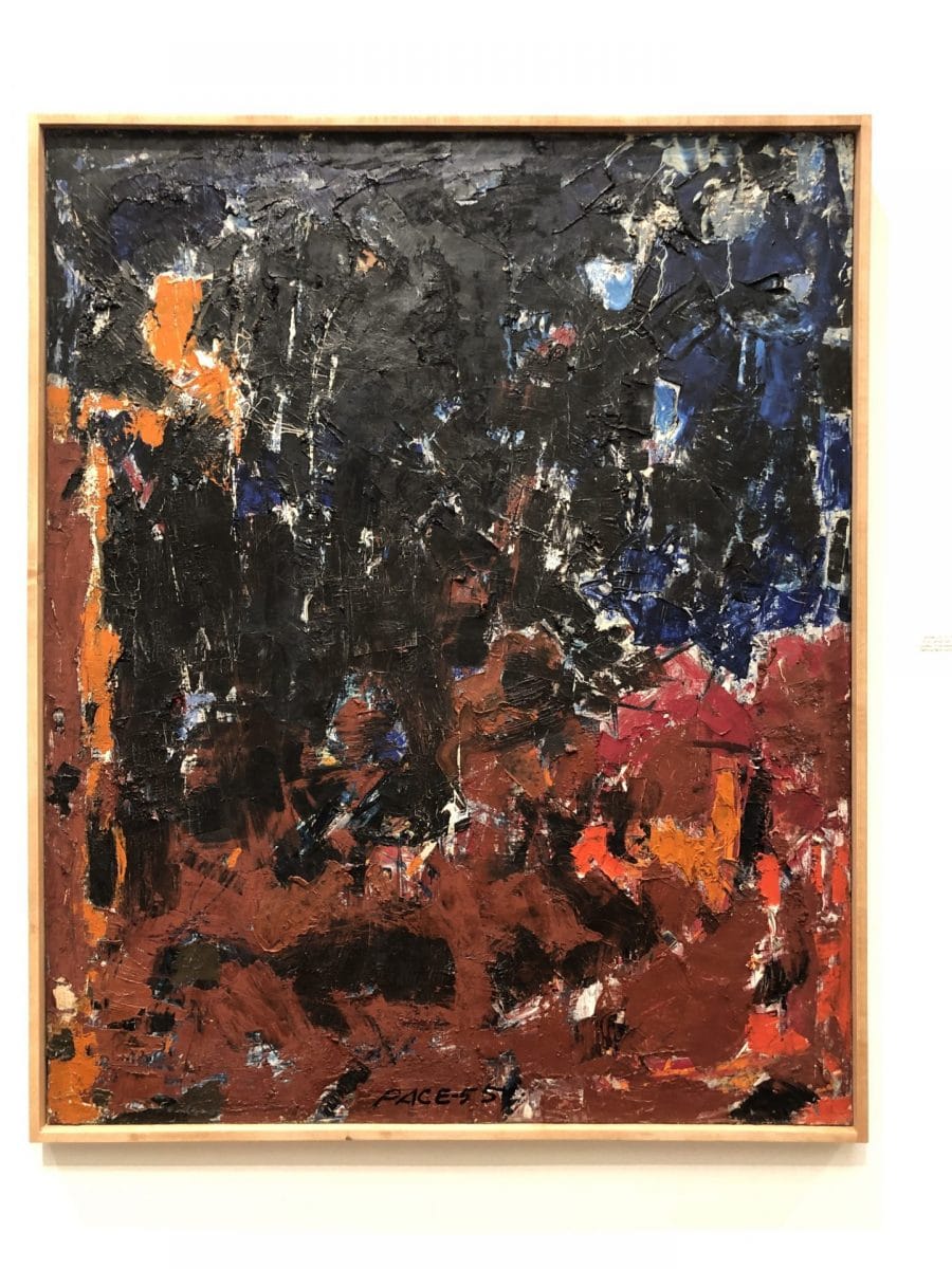
Oil on canvas, 44 x 36

In conclusion...
The three shows currently on view at PAAM can certainly all be viewed and enjoyed separately. However, each of these shows is enriched by their neighbors. They contextualize each other with their similar timeframes, and they resonate in their use of form and texture to create message and meaning.
Aw, this was an exceptionally nice post. Spending some time and actual effort to create a top notch article… but what can I say… I put things off a lot and don’t manage to get anything done.
Thanks so much for your comment! It means a lot to know that people read what I write.